
Quick answer: Decoration is where ceramic tableware is differentiated and where most quality complaints originate. The single most important decision is the decoration stage: under-glaze (most durable, food-safe, limited colour palette), in-glaze (a middle route), or on-glaze (widest colour and metallic range, sits on top of the glaze and carries the highest wear and food-contact risk). In 2026 the visible trends — gold trim, enamel colour, reactive glazes and cultural patterns — each sit on a different decoration stage, which is why two pieces that look similar can behave completely differently in service.
In this article
- The decision that governs everything: decoration stage
- Gold trim and metallic lustre
- Enamel colour and the painted look
- Reactive and specialty glazes
- Cultural patterns and the export question
- Minimalism and the single-motif direction
- Durability: how decorated ware actually fails
- Writing a decoration brief that survives production
- Frequently asked questions
The decision that governs everything: decoration stage
Ceramic decoration is classified by where it sits relative to the glaze. This single choice determines durability, the available colour palette, food-contact risk, and the number of kiln passes required — which in turn affects cost and lead time.
| Decoration stage | Where the decoration sits | Durability | Colour range | Notes |
|---|---|---|---|---|
| Under-glaze | Applied to the biscuit body, then covered by glaze | Highest; protected by the glaze layer | Narrower — pigments must survive the high glaze firing | Preferred where food safety and long service life matter most |
| In-glaze | Applied during the glaze firing so it fuses into the glaze | High; decoration sits within the glaze layer | Intermediate | A useful middle route; availability depends on the factory |
| On-glaze | Applied on top of the fired glaze, then refired at lower temperature | Lower; the decoration is the exposed surface | Widest, including gold and platinum lustre | Highest food-contact and dishwasher risk; needs explicit testing |
Two practical consequences follow from this table, and both are routinely missed in decoration briefs.
- Under-glaze decoration protects the food-contact surface. Because the glaze covers the decoration, the food touches glaze, not pigment. This is why under-glaze is the default recommendation when a buyer needs both colour and a strong safety position.
- On-glaze decoration adds a kiln pass and a risk. The decoration firing is an extra thermal cycle and an extra opportunity for defects, and it leaves the decoration exposed to abrasion, dishwasher chemistry and the food itself. On-glaze is not wrong — it is simply a different risk profile, and it should be chosen deliberately.
Gold trim and metallic lustre
Gold and platinum decoration remains the clearest premium signal in tableware, and demand for it is stable because it communicates value instantly at both the shelf and the table. The technique is a metallic lustre applied as an on-glaze decoration and fired at a relatively low temperature to develop the metallic film.
What buyers need to understand about gold trim
- It is on-glaze by nature. There is no widely used route that places a metallic lustre beneath the glaze while retaining a true metallic appearance. So gold trim carries the on-glaze risk profile: abrasion, dishwasher exposure and a food-contact question.
- Placement is a design decision with real safety implications. Many premium programmes solve the food-contact problem by keeping the gilded zone strictly outside the food-contact surface — a band on the rim outside the well of a plate, or a handle and foot ring on a cup. The regulation follows the food-contact surface, so the design can be arranged to keep the two apart.
- Dishwasher behaviour must be specified and tested. Metallic decoration degrades under repeated aggressive washing. If the item will be washed in a commercial machine, the decoration needs to be tested for the number of cycles the buyer expects, not assumed to be fine.
- Microwave use is generally incompatible. Metallic decoration and microwave energy do not mix. This must be stated on the packaging and in the product listing, and it should be treated as a hard constraint for any market where microwave suitability is assumed.
A concrete, testable convention worth adopting: always specify the food-contact zone on the technical drawing, then mark the decoration zone separately. When both zones are drawn, the factory can propose a decoration layout that respects them, and the testing scope becomes obvious. When neither is drawn, the decoration layout is left to chance.
Alternative metallic looks
Where a buyer wants the gold look without the metallic-decoration constraints, two alternatives recur. Gold-toned ceramic colour — a non-metallic pigment producing a warm ochre or amber tone — can be applied under-glaze, but it reads as colour rather than metal and will not satisfy a buyer who specifically wants lustre. Matte metallic-look finishes achieve a metallic appearance with different chemistry and can behave differently in washing; these must be tested on their own merits rather than assumed equivalent to lustre.
Enamel colour and the painted look
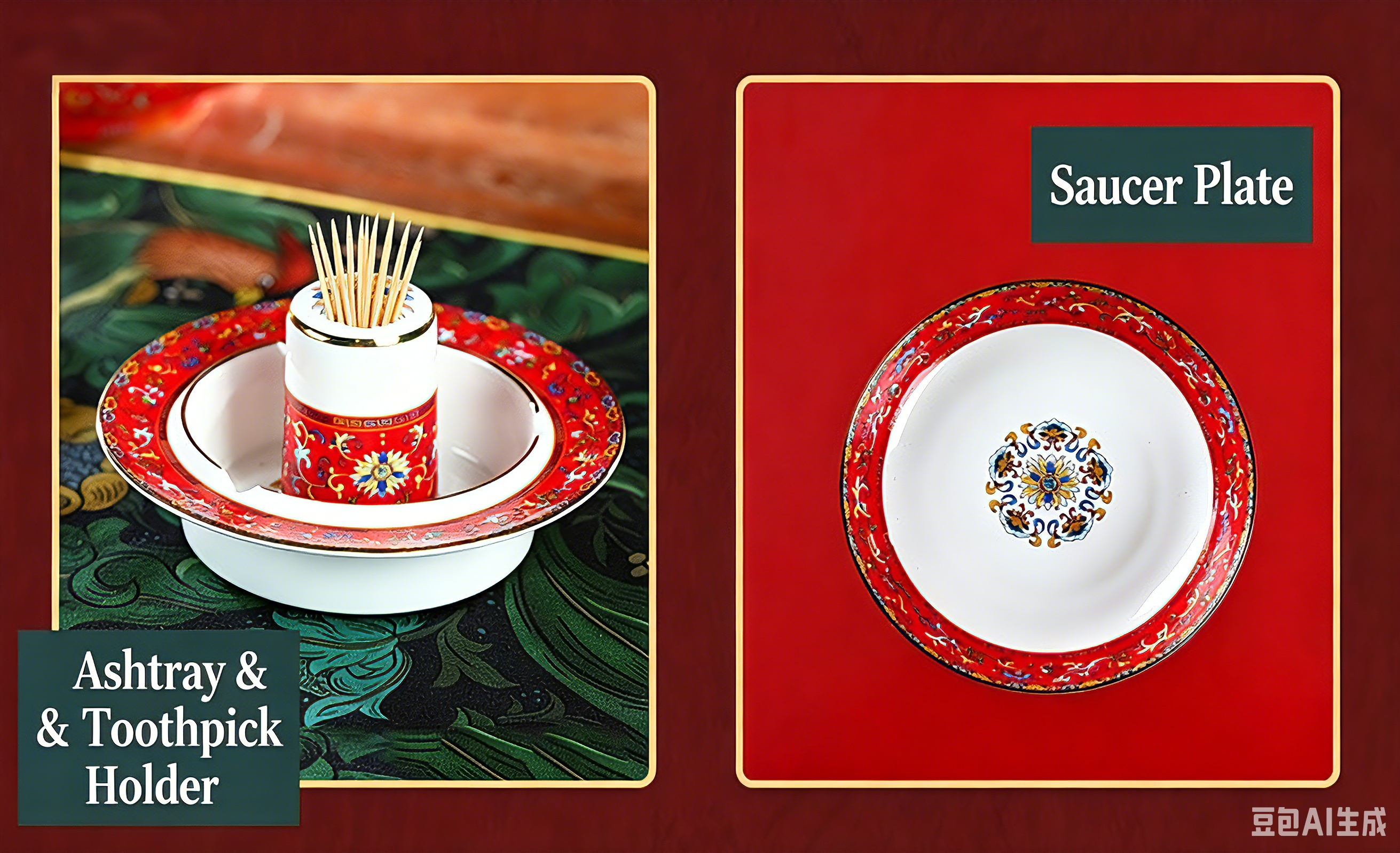
Enamel decoration refers broadly to richly coloured, opaque, sometimes raised decoration applied over the glaze, historically associated with vivid figurative and floral work. The visual signature is saturation and depth: colours that read as solid rather than translucent.
In 2026 the "painted look" demand splits into two technical routes that buyers often conflate.
| Route | Method | Visual result | Durability and considerations |
|---|---|---|---|
| Hand-painted enamel | Decoration applied by brush, piece by piece | Depth, variation, visible brushwork; each piece slightly unique | Labour-intensive; the least predictable step in production; expect longer lead times and higher cost |
| Decal enamel effect | Printed transfer applied and fired, replicating a painted look | Consistent, repeatable, sharper detail | Far more consistent and faster; the right choice for volume programmes |
| Over-glaze opaque colour | Solid colour applied on top of the glaze | Strong flat colour | On-glaze risk profile; good for non-food-contact areas and decorative exterior surfaces |
The critical point for buyers is that hand-painted decoration is a production-capacity constraint, not merely a cost premium. Throughput depends on workforce skill, and consistency varies between pieces by design. For a retail programme where every unit must photograph identically, hand-painting creates genuine merchandising risk. For a gift or artisan-positioned range, that variation is the product.
When specifying an enamel direction, decide which of these two you are buying. A brief that asks for "a hand-painted look" at a decal price point will produce either a quotation that seems excessive or a product that does not meet expectations — and both outcomes cost time to discover.
Reactive and specialty glazes
Reactive glazes produce colour and texture variation during firing rather than through applied decoration. The glaze chemistry is formulated so that the firing cycle itself generates the visual result: mottling, pooling, colour breaks, speckling, or a matt-to-satin surface.
Why this direction has grown
- It removes decoration labour. There is no decal to apply and no hand-painting, so the visual interest comes from the glaze and the firing rather than from a decoration operation. That usually means a shorter, more predictable production route.
- It reads as artisanal. The unplanned variation signals handcraft to a consumer, which suits casual dining, farmhouse and specialty retail positions.
- It hides minor surface variation. A mottled glaze is more forgiving of the small surface differences that a pure white glaze renders obvious.
The buyer's catch
Reactive glazes are, by definition, variable. That is the selling point and the problem. A buyer who approves a reactive glaze sample and then rejects a production batch for not matching it has misunderstood the technique. Before committing, settle two things in writing: the acceptable range of variation (ideally with a set of approved reference pieces, not one), and whether pieces outside the range are defects or acceptable production. Without that agreement, every inspection becomes a negotiation.
For reactive glaze programmes, agree the reference range using physical pieces rather than photographs. Photographs cannot capture the depth and surface character that this glaze family is bought for, and screens reproduce colour inconsistently. A set of five approved pieces held by each party resolves more disputes than any specification document.
Cultural patterns and the export question
Patterns with cultural specificity — East Asian motifs, traditional florals, geometric traditions, calligraphic elements — travel well when they are used as design vocabulary and poorly when they are treated as self-explanatory. The difference is in how the pattern is framed for a market that does not share the reference.
| Pattern approach | How it lands in an export market | What makes it work |
|---|---|---|
| Motif as ornament | A recognisable graphic used for visual character | Pattern is legible on its own; no cultural knowledge required to enjoy it |
| Motif with stated meaning | The pattern is accompanied by a short explanation of what it represents | The story becomes part of the product and justifies premium positioning |
| Full traditional context | A faithful reproduction of a specific traditional design | Appeals to buyers seeking authenticity; needs accurate explanation to avoid confusion |
| Generic "oriental" styling | A blend of unrelated motifs presented as a single style | Weakest position — reads as inauthentic to buyers familiar with the traditions |
Three practical notes for export programmes using culturally specific patterns:
- Explain, do not assume. A short, accurate description of what a motif represents adds perceived value at no production cost. It also reduces the risk that a buyer's marketing team invents an interpretation that is inaccurate.
- Check colour symbolism conventions before colourway decisions. Colour carries different associations in different markets, and this affects both retail acceptance and gifting suitability. Confirm the convention for your specific destination rather than generalising.
- Registration complexity drives cost. Intricate patterns with tight registration tolerances across multiple shapes are harder to keep consistent than bold motifs. If a pattern must appear on eight different shapes at consistent scale, test the least favourable shape first.
Minimalism and the single-motif direction
Alongside the decorative directions, a strong counter-current has held through 2026: undecorated or minimally decorated ware. The forms are clean, the glaze is usually white or a single soft tone, and the interest comes from proportion, rim geometry and translucency rather than from applied pattern.
This direction suits bone china particularly well, because translucency and a warm tone are the product. It also has three commercial advantages worth noting: fewer production operations and therefore shorter, more predictable lead times; easier specification stability for hospitality reorders; and simpler photography, since there is no pattern to reproduce accurately at thumbnail size.
Where decoration does appear in this direction, it is typically a single restrained motif — a rim band, a small mark near the foot, a subtle tonal variation — placed deliberately rather than ornamenting the whole surface. This also happens to be the safest food-contact configuration, since decoration kept to the rim edge or exterior stays clear of the food-contact surface.
Durability: how decorated ware actually fails
Decorated tableware fails in four characteristic ways. Knowing them makes a specification more precise, because each failure has a different prevention.
| Failure mode | What it looks like | Root cause | Prevention |
|---|---|---|---|
| Decorative wear | Gold or colour fading, thinning or wearing through at contact points | On-glaze decoration abraded in use and washing | Specify decoration stage and wash-cycle testing; reposition decoration away from contact zones |
| Dishwasher attack | Colour dulling, metallic film pitting, glaze surface etching | Abrasive detergent and hot cycles acting on the exposed decoration | Specify the expected cycle count and test to it; choose under-glaze where compatible |
| Crazing | Fine cracks in the glaze surface | Thermal expansion mismatch between body and glaze | Factory glaze-body fit control; not a decoration issue but often blamed on decoration |
| Chipping at the rim | Small chips at the edge, sometimes taking decoration with them | Mechanical impact, thin or unprotected rim edge | Rim profile specification and edge treatment; retail packs with adequate inner protection |
The first two are the decoration-specific failures, and both are addressed by two questions asked early: what decoration stage is this? and how many wash cycles must it survive? A factory that can answer both specifically is a factory that understands what it is selling.
Writing a decoration brief that survives production
Most decoration problems originate in an incomplete brief, and they surface at the sample stage or, worse, at final inspection. A brief that prevents this contains eight things.
- Decoration stage. Under-glaze, in-glaze or on-glaze. State it; do not leave it to the factory's default.
- Food-contact zone drawing. Mark the area where food will touch, and mark the decoration zone separately on the same technical drawing.
- Colour reference with a physical standard. Pantone codes in a document render differently on every screen and every press. Supply a physical colour standard, and expect the factory to match against fired, glazed colour rather than ink.
- Registration tolerance. State how far the decoration may shift from its nominal position, in millimetres. Without a number there is no possible pass/fail decision.
- Wash-cycle expectation. The number of dishwasher cycles the decoration must survive, and whether commercial or domestic conditions apply.
- Microwave and oven use. Whether the item must be microwave-safe, and whether any metallic decoration is acceptable as a result.
- Reference pieces. At minimum one approved piece; for reactive or variable glazes, an approved range of several pieces.
- Acceptable variation statement. In writing, describing what variation is production-normal and what constitutes a defect.
The registration tolerance line is the one most often omitted and the one that saves the most argument. A decoration applied 1 mm off nominal on a 270 mm plate is invisible in a photograph and obvious on a table setting for eight. If the tolerance is not written down, the inspection is decided by opinion.
Frequently asked questions
Is under-glaze decoration always better than on-glaze?
Not always better, but it is more durable and gives a stronger food-contact position, because the glaze covers the decoration. Its limitation is colour range: some pigments cannot survive the high glaze firing. On-glaze is the right choice when you need a specific colour or a metallic finish and can accept the wear and testing implications. Choose deliberately rather than by default.
Can gold trim be used on items washed in commercial dishwashers?
It can, but only if the decoration has been tested for the number of cycles the operation expects. Metallic decoration degrades under repeated aggressive washing, and the degradation is progressive rather than sudden. Specify the cycle count, test to it, and expect to reposition the gilding away from contact and abrasion zones.
Why does my decoration look different from the sample?
Two usual causes. First, colour matching: fired ceramic colour depends on glaze, firing temperature and thickness, so a pigment mixed to a screen or print reference will not match exactly. Supply a fired physical standard instead. Second, variability: reactive glazes and hand decoration vary by design. Agree the acceptable range in advance with physical reference pieces.
Is hand-painted decoration worth the premium?
It depends on where you sell. In a high-end gift or artisan-positioned range, the variation is the product and the premium is defensible. In a retail programme where every unit must photograph identically, hand-painting introduces genuine merchandising risk and a much longer, less predictable production window. A decal route that reproduces a painted look is often the better commercial answer.
How many colours can one decoration use?
There is no hard rule, but cost and complexity scale with the number of decoration screens or print passes. Each additional colour adds a screen, an alignment requirement and a quality control check. Programmes are usually best served by a small number of well-chosen colours applied consistently than by a broad palette that multiplies production risk.
Do cultural patterns sell in Western markets?
They can sell well, particularly when the motif is legible on its own and accompanied by a short explanation of what it represents. The weakest position is a blend of unrelated motifs presented as a single style, because it reads as inauthentic to buyers who know the traditions. Treat the pattern as design vocabulary and explain the reference.
Should decoration appear on the food-contact surface at all?
The safest configuration keeps decoration outside the food-contact zone — on the rim edge, the exterior wall or the foot. Where decoration must be in the food-contact area, under-glaze placement is preferable because the glaze covers the pigment, and the finished item should be tested for migration under the destination market's protocol.
Developing a decoration programme?
Send us your artwork direction, the shapes you plan to decorate and your market. We will come back with a recommended decoration stage, the shapes to test first for registration, and indicative tooling and unit costs.
See current decorated styles
Browse mug and cup ranges in bone china and fine porcelain, with a range of decoration finishes available for private label.
Related reading
Customization, OEM and ODM options for decorated ceramic tableware, including decal development and tooling.
Sources: ceramic decoration practice for bone china and fine porcelain tableware (under-glaze, in-glaze and on-glaze application routes), industry-standard wear and dishwasher testing for decorated tableware, food-contact requirements affecting decorated surfaces (EU Regulation (EC) No 1935/2004 and Directive 2005/31/EC, U.S. FDA Compliance Program Guidance Manual 7117.07, German LFGB §30), and observation of decoration directions across current tableware ranges. Trend descriptions are directional; confirm the technical route with your manufacturer before committing to artwork.
Related articles in this series
- Ceramic Tableware Compliance in 2026: FDA, LFGB, Prop 65 and EU Rules
- Sustainable Ceramic Tableware Manufacturing: Glaze, Energy and Packaging in 2026
- Ceramic Tableware Lead Times in 2026: A Buyer's Supply Chain Timeline
- Bone China Market Trends 2026: What Retail and Hospitality Buyers Want
More sourcing and market analysis for ceramic tableware buyers is published in our Industry News collection.