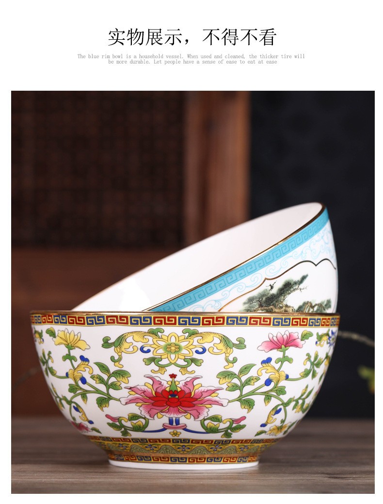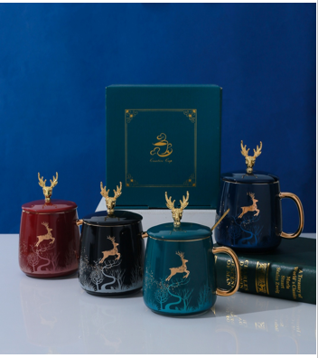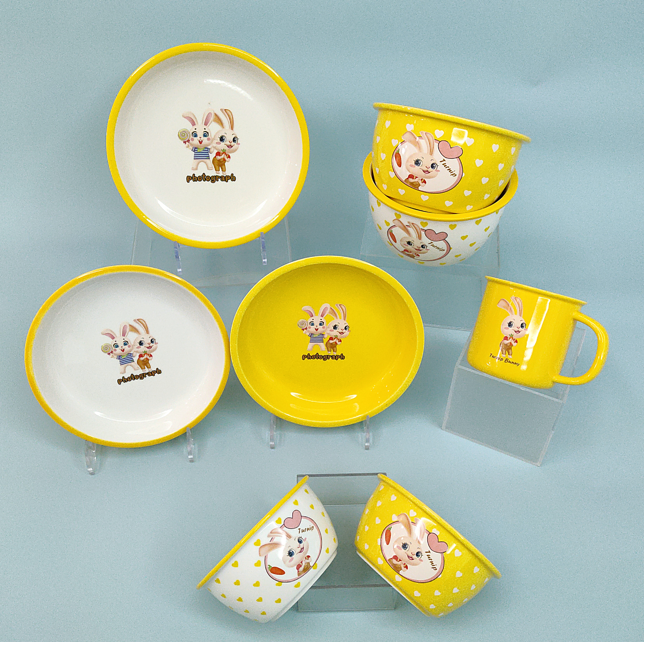
A buyer sends a reference - a Pantone chip, a fabric swatch, a photograph or a competitor's sample - and asks for "this colour" on a ceramic body. What comes back from the kiln is close but rarely identical, and understanding why is the fastest way to shorten a colour development programme and avoid a production batch that no longer matches the approved sample.
This guide explains how glaze colour is developed for custom ceramic tableware, why fired colour shifts, and how to specify colour so that every shipment matches the first approved piece.
1. Body colour and glaze colour are two different decisions
The colour a buyer sees is the result of two layers. The body contributes its own tone - bone china reads warm ivory, high-fired porcelain bright white or slightly blue-white, stoneware often warmer and more textured. The glaze sits on top and can be transparent, translucent, opaque, tinted or fully coloured. A "white" mug is therefore not a single specification: it is a body plus a glaze, and changing either one changes the appearance.
Practical consequence: when a colour is approved, record both the body and the glaze recipe reference. A later request to "make it in a cheaper body" will otherwise change the colour as well.
2. How a reference colour is matched
Colour development is an iterative process, not a calculation. The factory mixes a glaze, applies it to a test piece in the chosen body, fires it under production conditions, and compares the fired result with the reference under standard lighting - ideally daylight and a controlled light booth rather than office lighting or the screen of a phone. The recipe is then adjusted and refired. Depending on how close the reference is to the existing palette, this can take two or three rounds; a saturated red, a deep navy or a metallic tone usually needs more.
3. Why fired colour drifts
- Firing temperature and cycle. Glaze colour is chemistry. A small difference in peak temperature or soak time shifts many colours, and some pigments are far more sensitive than others.
- Kiln position. Heat distribution inside a kiln is never perfectly uniform, so pieces fired on different shelves can differ subtly. Production runs are normally planned so that one order is fired together wherever possible.
- Glaze thickness and application. Dip, spray and flow-coating deposit different amounts of glaze; thin areas read lighter, thick areas can darken or craze.
- Body interaction. The glaze is not fully opaque in every recipe, so the body tone underneath influences the final colour.
- Surface finish. Gloss and matte surfaces reflect light differently. The same pigment can look noticeably different in a matte version.
4. Choosing a glaze family for your requirement
- Transparent gloss - the classic finish, lets the body show through, easy to keep consistent.
- Opaque gloss - solid colour, good for strong brand colours and for masking body colour differences.
- Matte / satin - softer, contemporary look, popular in stoneware and in specialty coffee ranges. Slightly higher risk of marking from metal cutlery.
- Reactive and speckled glazes - deliberate variation piece to piece; the "effect" is the specification, so approval criteria must describe the acceptable range rather than a single target.
- Crackle / crystalline - decorative effects that require their own testing if the item will meet food-contact and dishwasher requirements.
- Metallic and gold effects - applied as decoration rather than as body glaze, and normally not microwave safe; this should be stated on the packaging.
5. Keeping colour consistent between batches
Colour consistency is a production discipline, not a single test. The measures that matter are: a retained reference sample held by both parties, a recorded glaze recipe and application method, firing under matched conditions, and an agreed inspection method - visual comparison against the reference under defined lighting, and an acceptance statement of what difference is allowed. Where a buyer needs tighter control, production can be grouped into single firing batches for one order rather than drawing from stock produced across several firings.
6. What affects minimum order quantity
- New glaze colour - a development charge and a minimum batch, because the glaze must be mixed and the kiln loaded economically.
- Existing palette colour - little or no development cost, and the lowest minimum.
- Number of colours in one order - each colour adds setup, glazing time and kiln planning.
- Decoration on top of colour - decal or hand-painted work adds its own minimums, especially where a new decal must be produced.
Sourcing checklist
- Provide a physical colour reference, not a phone screenshot.
- State the body as well as the colour, and confirm which one may change.
- Ask how many sample rounds are included in the development charge.
- Agree the lighting condition and method for colour approval.
- Confirm whether the finish is gloss, satin or matte, and whether the item must be dishwasher and microwave safe.
- Record the glaze reference, application method and firing condition on the approved sample documentation.
- Ask about the minimum quantity for a new colour versus a colour already in the palette.
Juxinmeng Ceramic develops custom glaze and body colours for porcelain, bone china and stoneware ranges, including gloss, matte, reactive and metallic decoration. Send us your reference colour and target quantity and we will propose a glaze direction and sample plan.